New User Interface Now Live — Log in to see it in action
We have launched a major upgrade to the Verified Data UI, designed to make your work faster and more intuitive:
- Clearer audit reports— improved at-a-glance layouts.
- Simplified settings— easier multi-audit management.
- Consistent data flow— a smoother, more natural app experience.
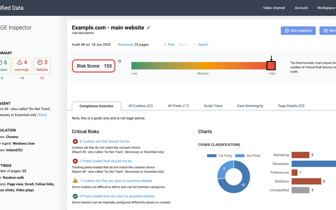
Designing a UI for data-heavy tools is always a challenge. Information needs to be easy to absorb, structured logically, and simple to navigate. At the same time, features must be prominent enough to guide new users without becoming distracting once they’re familiar.
This summer, Piotr and I rethought the entire experience. As data practitioners first and tool builders second, we’ve always focused on usability. But I’ll admit — even after years working with Google Analytics (Universal is still my benchmark for great UX), I underestimated how tough it is to get this balance right.
The result is a cleaner, more intuitive interface that makes navigating audits easier than ever — applicable to both our Verified ANALYTICS and Verified CONSENT tools.
Log in and explore the new experience.
As always, your feedback is essential — we are always learning. Let us know what works, what could be better, and what you’d like to see next. You can reach me directly at hello—{@}—verified-data.com.